The best design work is often woefully misunderstood
As the Donmar Warehouse finishes its week-long festival of design, Matt Trueman looks at why bigger isn’t always better

© Cameron Slater
There is such a thing as death by design. Sometimes a set squeezes the life out of a show, and the grandest designs can do more harm than good. Ironically, they’re often the ones that win the plaudits and prizes. Designs that make themselves noticed tend to wind up in notices, but in doing so, they can distract and detract. Audiences go to see shows, after all, not sets.
Even half a century after designers such as Jocelyn Herbert, Percy Harris and Ralph Koltai revolutionised the art-form, stressing the importance of practicality over prettiness, design is still judged, more often than not, on appearances. Even in the last decade, practices have come on leaps and bounds, arguably more than any other discipline in British theatre, and a new generation of designers, among them Tom Scutt and Chloe Lamford, Lizzie Clachan and Miriam Buether, have transformed the way we see the stage. Nonetheless, the best design work is still woefully misunderstood.
That’s one of the reasons last week’s Donmar on Design festival was so important. A week of panel discussions, studio sessions and podcasts curated by Scutt, the Donmar’s associate designer, it sought to shed some light on contemporary design – not just the sets that end up onstage, but the work that goes into them behind the scenes. In raising questions about training and sustainability, career pathways and pay, influences and new ideas, it provided an insight into the design process – and process, really, is the key word here.
No design, on occasion, is the best possible design
Because the best designs are often the simplest. Some do next to nothing. Others wring a lot from a little. Instead of imposing on a show, they step back and give space. No design, on occasion, is the best possible design. An empty stage can be far more effective than a full room.
Take Scutt’s own work on King Charles III. His stage was nothing more than a rectangle of red carpet, four funereal candles and a frieze, wrapped on the Almeida’s bare brick back wall, that showed thousands of faces looking on in horror. Not only did it defer to the actors and to the play, deflecting attention away from itself and onto the action, it framed the play beautifully. Those faces reminded us of what Mike Bartlett’s play was missing: us, the people, the population at large. We were looking at kings and queens, politicians and generals, but everything they did impacted on us all.
As designers move up the ranks, it can be all too tempting to upscale their designs
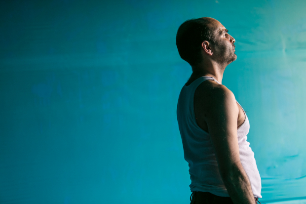
The point, though, is that as much thought goes into such spare designs as into any other – often more. At Friday night’s final Donmar on Design panel, on the future of design, the daring young designer Rosie Elnile and director Ellen McDougall talked through their work on The Unknown Island. Elnile covered the whole theatre – walls, floor and ceiling – in turquoise plastic. As simple, and startling, as that single choice was, the pair explained that it was made with rigour. In fact, its bravura simplicity caused a lot of stress. The two of them questioned it over and again. Is it enough? Is it a cop out? Is it serving the play? What’s the exact colour, the right material, the shape of the space?

© Cameron Slater
At the same event, another talented young designer Camilla Clarke spoke about the benefits of a tight budget. It’s the old necessity-is-the-mother-of-invention principle. The pressure to keep costs down can, ironically, free a designer up. Constraints can be good for artists. They can force you to think outside the box or add an extra element of diligence into a process. What does this design really need? What could it do without? How does it make an impact without relying on elaborations or scale? Can it impress without being impressive?
As designers move up the ranks, into bigger spaces at bigger organisations with better production facilities and more cash, it can be all too tempting for them to upscale their designs. The risk is that a design does too much, oversteps its mark and overwhelms a show. It happens again and again – and again and again, those designs gain recognition. Bigger, however, isn’t always better.


