
Let's talk about sets: Ana Inés Jabares-Pita on Lela & Co. at the Royal Court
We chat to set designer Ana Inés Jabares-Pita about the process of designing Cordelia Lynn’s new play
17 September 2015
Having the chance to design for a venue such as the Royal Court Theatre is a great privilege. I have to admit that it is quite intimidating designing for a theatre where some of the best writers of the world started their careers, the bar is set high!
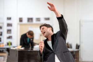
When I first received the script of Lela & Co. by Cordelia Lynn, I couldn't imagine anything else than darkness. No space at all, just absence, but I could think of songs, a lot of Spanish songs. So I sent a playlist to the director, Jude Christian, as an answer to the script. The songs were all about trapped girls; they were trapped in inconvenient relationships, difficult lives, lost or misunderstood.
The name in the title of the play, Lela, seemed to me visually powerful. Even though the only thing I could imagine was darkness there was something really appealing about her name, its length, its structure, its sonority. It was interesting to discover the fact that her name, Lela, had four letters, which is the same number of men that appear in her life and little by little tuned off a part of her light.
One of these four men was involved in all her life changing events. Each of them always offered her or bought her something pink and sugary; a cake with pink icing, a lollipop, a cocktail. All these sweet pink items became represented by pink candy floss, with its meaning shifting throughout the play and becoming darker.
Lela is trapped, and her world becomes increasingly tiny, that is why the stage is in a corner of the space. She is cornered by the seating configuration, and the audience.
The ceiling is full of glass bubbles, each with a bird inside, the significance of which should become clearer throughout the show.
At the beginning of her monologue Lela is engaging and funny. That is why the idea of a talk show emerged. I could see her name in big neon lights, red curtains and a black and white floor. The idea was that this space could also suggest many other things such as a circus space or a night club. It was interesting to leave it slightly open to the audience’s imagination.
This design is full of metaphors. My job for this production was to say a lot through few elements and without being explicit. Generally in my designs the use of visual metaphors is very present. Everything that is on stage has a very good reason for being there. Each element of the design is meant to change through audience perception as the play develops.
As a designer it is a big responsibility to find the right visual language for the text, especially knowing that this is going to be the first visual reference of a world premiere of a play.
The process so far has been really exciting. I feel very fortunate to work with such a talented team and such a wonderful group of people.
Lela & Co. runs at the Royal Court until 3 October. Find out more about Ana's work here.
Related Articles
See all
Latest Reviews
See all

Latest Videos

The cast of Death Note on shaping the manga musical for its fully-staged UK premiere
Performances begin at the Barbican Theatre later this month