
Space on stage: how we created Mars and more at Theatre503

© Sarah Beaton
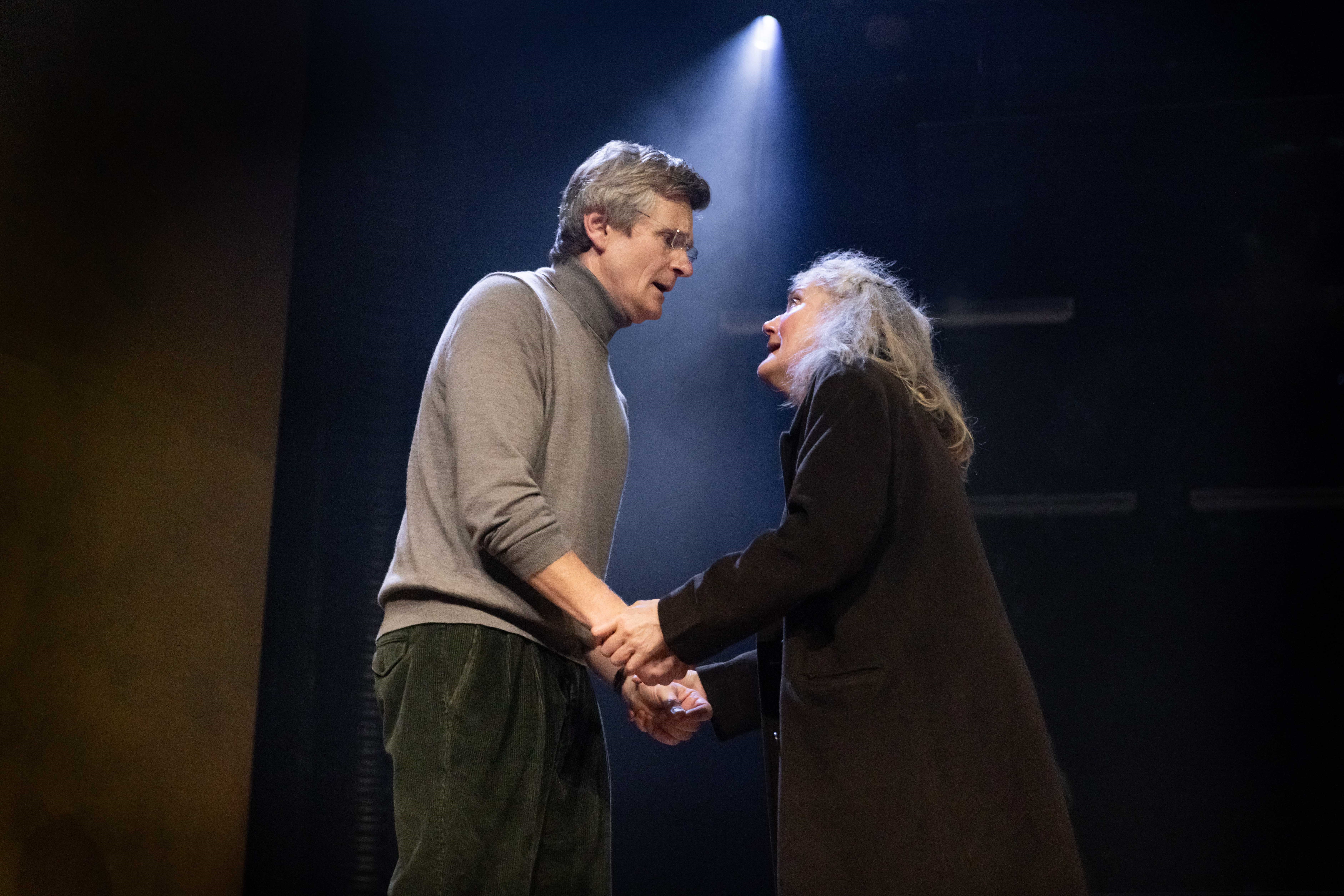
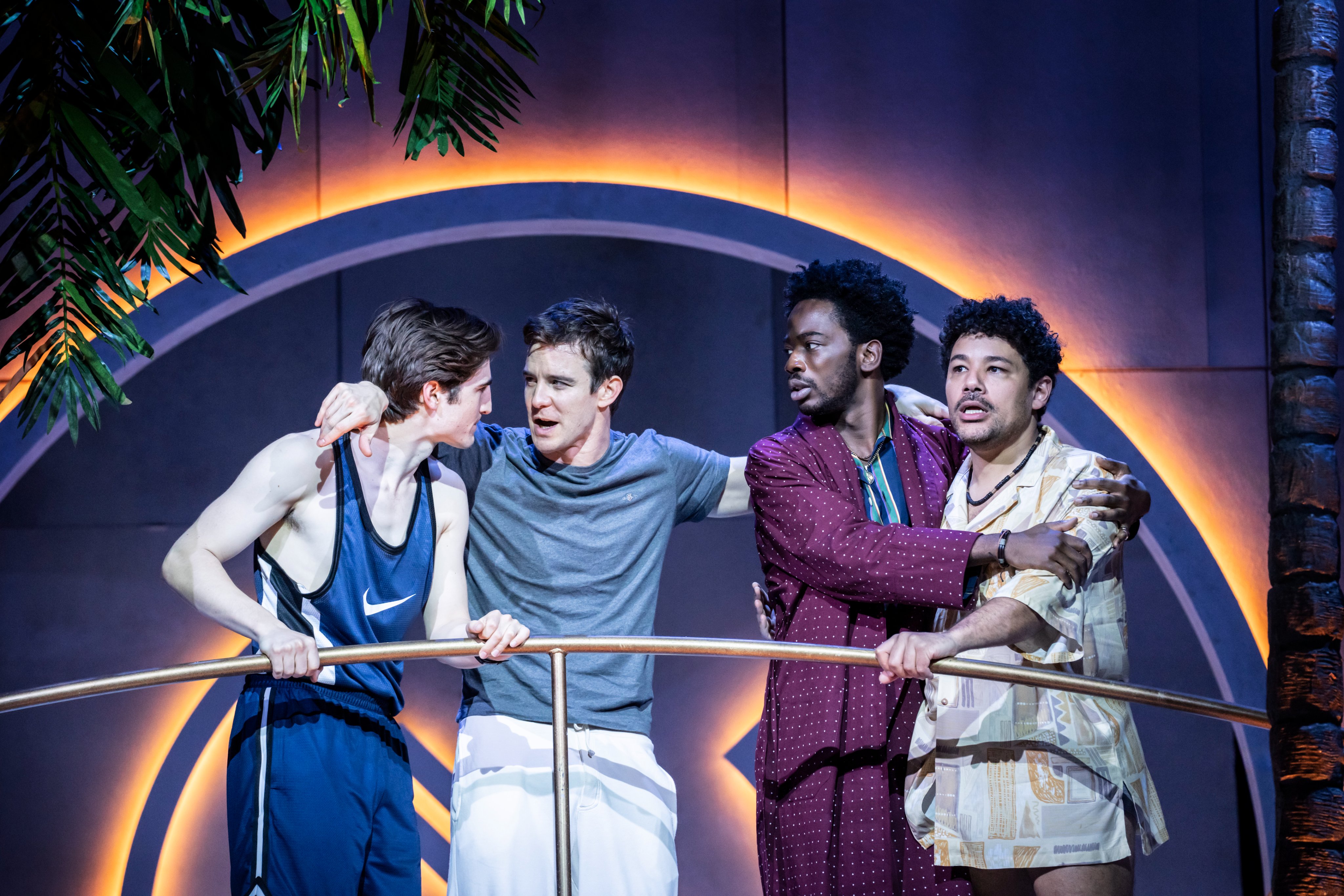
Space, fertility, possibility and loneliness. Andrew Thompson‘s award-winning play, In Event of Moone Disaster, epically explores all of these themes and more. The play, ambitious in structure, moves between three time periods: 1969-73, 2017-18 and 2055-54.
A huge inspiration to me was the work of photographer David Schermann and his beautiful series of photographs based on solitude and alienness; his colour palette and references to nature encapsulated how I envisaged Sylvia’s future on Mars to be.
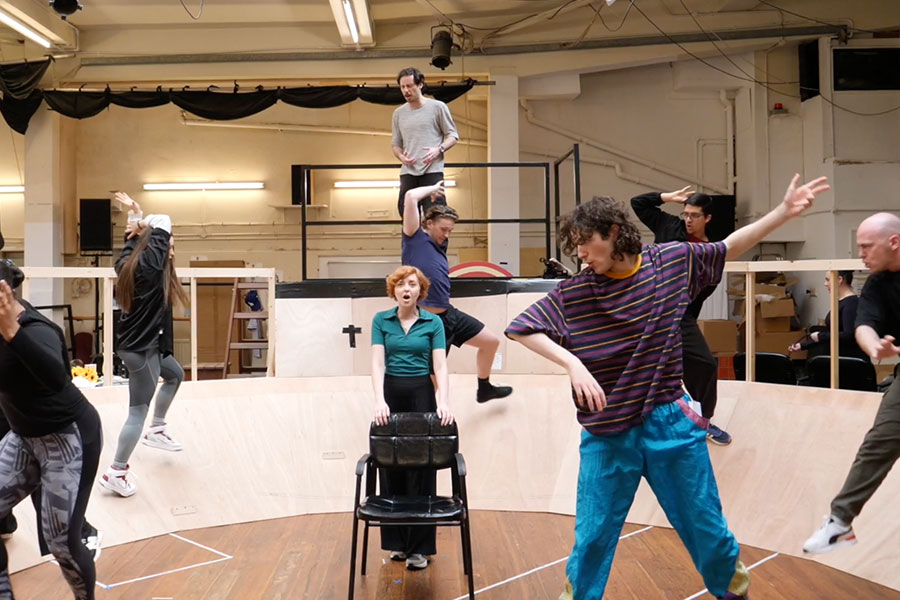
Director Lisa Spirling and I were interested in creating a landscape for the three time periods to co-exist without the need for major scene changes, furniture or large props. We immediately realised that Theatre503‘s performance space, an extremely intimate 3.5m deep by 5m wide, would restrict design potential. Notwithstanding, we aimed for fluid changes and bleeds between scenes and an entrance stage left and stage right in order to play out parallel narratives.
The feeling of an infinite environment felt very important to capture the action
The play’s recurring themes of fertility and the 1969 moon landing became a starting point in terms of what form the space would take. I looked at images of the human body: exploring the womb, follicles and eggs. The reddish-brown hues of embryos and transparent amniotic sacks became interesting textures and qualities to explore. I began experimenting with semi-transparent materials such as tracing paper, frosted Perspex, semi-translucent rubber and PVC; lighting these materials from the front and back, creating two contrasting atmospheres depending on which way the light was manipulated. Lighting onto it gave the illusion of sterile space, lighting through it created a cosmic space. The feeling of an infinite environment felt very important to capture and hold the action. We had decided that projection would feature in the design so I was aware that the materials I chose in the set would need to accommodate this medium.

© Jack Sain
Experimenting further to create a limitless space, I began playing with curves. What if all the edges of the space were curved, if the stage curves around into the audience, if it curves and tapers offstage? I began playing with curved steps. Levels became important to help present parallel time periods. Lisa and I both felt the simpler and sparser the stage, the cleaner and more symbolic the playing space would become. We decided that two curved screens would help to open up the space and create a large multi-levelled canvas to play on. I then created a gradient with a soft horizon line running along the set to make one entity. This gradual change of colour from warm mauve to cream helps the eye to be drawn into an expansive nothingness.
I looked at images of the human body: exploring the womb, follicles and eggs
It is impossible to discuss the set design without acknowledging the importance of the costumes and props in creating the overall visual language. In such a streamlined landscape, the choice of these items had to be acutely specific and detailed to the characters’ circumstances.
My aesthetic is often minimal and metaphorical, favouring what is essential over realism, however the consideration for how the materials interact with light, how the space changes and the relationship of costume and props to the space and actors is never simple or easy to achieve. To strip away all the superfluous and expected is as difficult as finding it and putting it in front of an audience.
In Event of Moone Disaster runs at Theatre503 until 28 October.